When we thought about title choices, we were looking for something that would stand out but still quite plain as there's so much going on in the OTS we didn't want it to be over the top. The title of the film would say a lot about the film, therefore it has to stand out, and look good enough to grab our audiences attention.
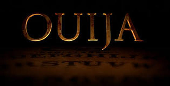
The title for the film 'Ouija', suits the film, as the font of the writing is the same as the writing you would find on a ouija board. Therefore the title suits the theme of the of the film, and would most likely attract more viewers.
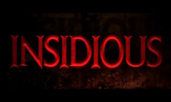
We liked the title choices for insidious as it was different. The colour is bright red and really stands out. As well as that it's different to something we'd go for. The film has to do with a devil, the font has devil horns on it which matches the theme of the film.
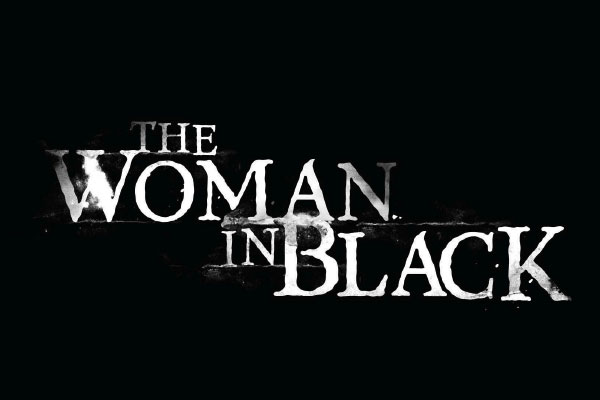
The Woman in Black's title we really liked, as it's something we wanted. It was plain and in black and white. The font of the title looks like a chalk and board, which could be set back to the year the film was set in.
Although we like this title, we felt that it wasn't suited to the theme. As well as that, talking colour scheme wise, it did not stand out and it looked too much for the title sequence.
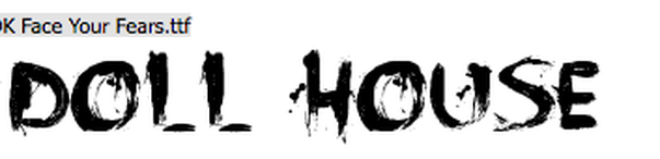
We really liked this this one, as it stands out. The font looks like it's been drawn using blood. We tried using the colour red, but it didn't look as nice as we thought it would.
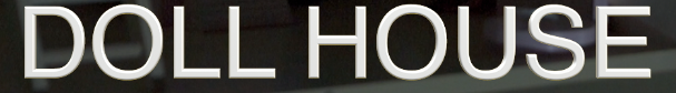
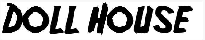
Final choice was this font as we just went for a simple title choice. Instead of going for an over the top title, we chose simplicity. We felt that it fitted well with the OTS, and that it didn't look to out of place.
