Choosing the right font in important because it needs to be readable and be able to stand out and the font will need to match the certain style of film you're making as this will make your OTS seem much professional.
For example in a horror movie it needs to bold, dark and gloomy
For example in a horror movie it needs to bold, dark and gloomy
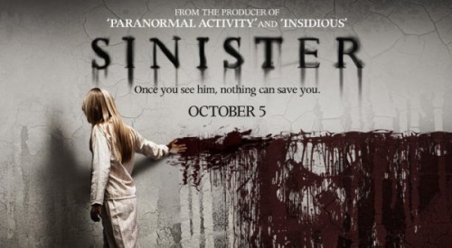
It shouldn't be fancy writing with cartoons and bright colours as it needs to look appropriate for their target audience. This is an example of a really good font title because it ties in with their film and makes the audience want to watch more.
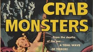
We wouldn't use this type of font because it doesn't link in to their trailer and doesn't look appealing to their target audience. You can't tell that this is a horror movie until you actually watch it.
